Wondering why car brands are updating their logos? We have the answer for you!
Wondering why brands are updating their logos? We have the answer for you!
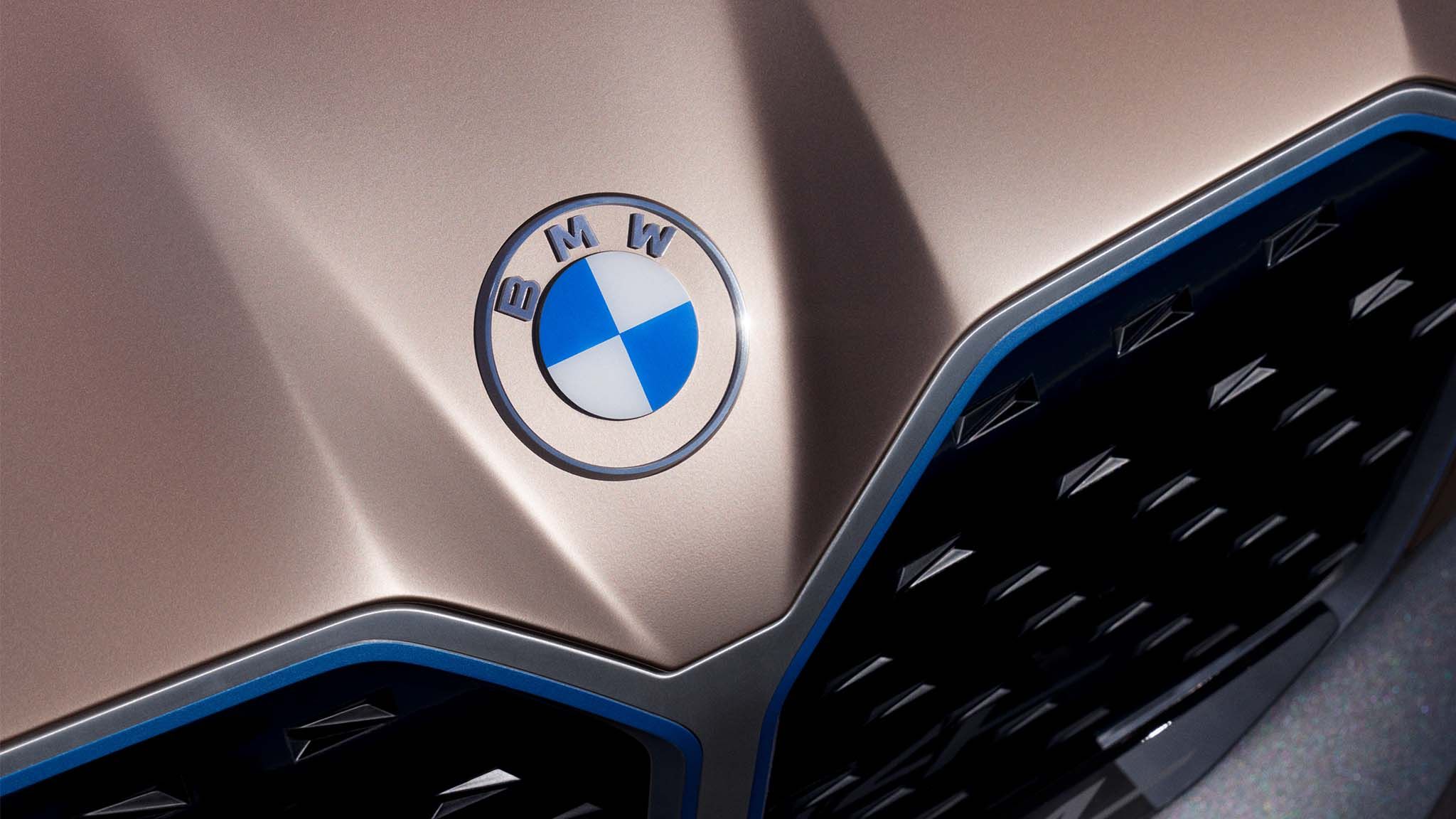
 BMW's new logo on the front of the BMW i4
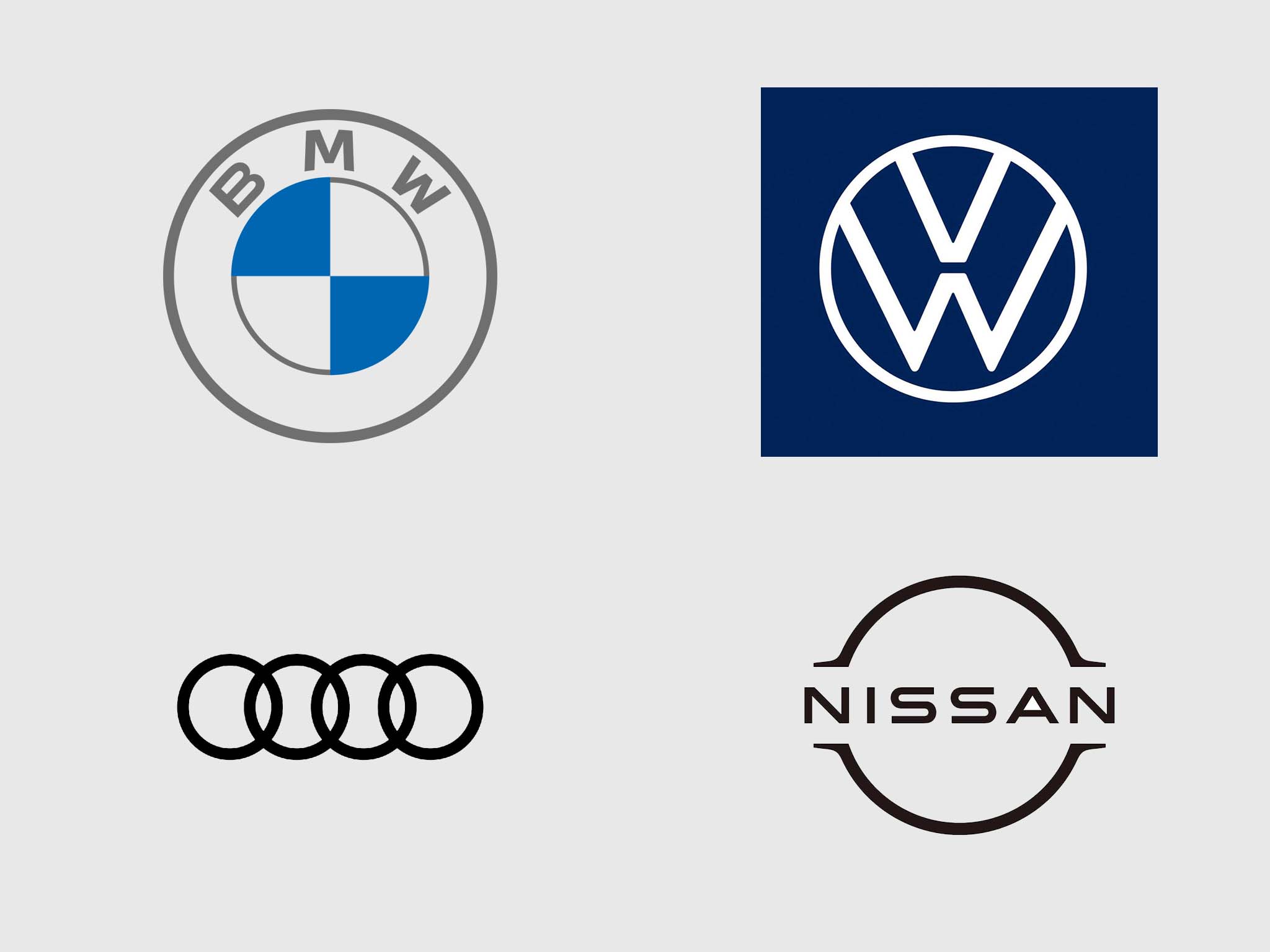
Everyone’s been talking about the BMW i4’s grille, but no one seems to be talking about what sits right above it! The BMW logo has been given a refresh for the first time in over 20 years, and well, it has polarised opinions much like the car’s grille! The new logo is a flatter design, without the visual enhancements like the shadows and embellishments that give the older logo a 3D effect. We’ll get specifically to the BMW logo in a bit but this switch is not an isolated case. Last year, Volkswagen unveiled its new brand logo and identity alongside (incidentally, another electric car) the ID.3. Volkswagen’s new logo follows the same style — it is minimalist, has gotten rid of the 3D effect and chrome treatment on the older logo. Prior to this, in 2017, Audi rid itself of the shadows in its rings and as of three days ago, Nissan filed for trademarks for its new flat design logo.
 Flat design is where a lot of car companies are heading with their logos
Design trends are constantly shifting and car companies have to evolve to keep up to. There’s a number of reasons why these logos are being altered from the skeuomorphism that was so popular in the 2000s to this new age design. Let’s take a deeper look.
To understand what is changing when it comes to car logo design, let us compare the two logos side by side. First up, the BMW logo. BMW’s logo has changed a number of times in the company’s history but this change is the most significant one yet. The most obvious change is the flat style — no longer does it have borders that are as thick on each element and the 3D effect is gone. That means there are no highlights and shadowy areas, and there is no texture on it. The older design follows an idea called skeuomorphism where an object on a digital interface mimics its real world counterpart, but that is a style that is now considered dated.
The most radical change here has to be the deleting of the black element under the BMW lettering. Now whether this was a smart design choice or not is a whole other debate. The new logo is supposed to signify “openness and clarity”, which is probably what designers were going for when they made that call to leave the space behind the letters empty. But many argue that the lack of a background could do just the opposite, since BMW has no control over what is behind it. Something else spoken about when the logo was launched is it was done to meet the “challenges and opportunities of digitisation on brands”, followed by the fact that this will be used only on new media, while the old logo will continue to be present on its cars and in dealerships.
This ability to be visible in the new, digital world is precisely what pushed Volkswagen to update its logo as well. Again, reductionism was the polestar when it came to modifying the old logo to the new one and what we are left with is an aesthetically simple, but contemporary design. The idea again, is to be more recognisable on digital media. I remember the Ed coming back from the IAA and recounting a conversation he had with Volkswagen’s Chief Designer, Klaus Bischoff. Bischoff told him a lot of customers are going to start interacting with their cars through phones and even smartwatches. And while the old logo had no place being on a smartwatch, the new one did! But at the same time, it has to look good on their factories and in their dealerships. “Light is the new chrome”, he says and the VW factory in Wolfsburg now has a massive illuminated (new) logo at the top of its building. Could logos on cars be lit up in the future? Volkswagen certainly seem to be hinting at it strongly — the ID. Crozz showcased at Auto Expo had an illuminated logo
Skeuomorphism became popular at a time when digital interfaces were rapidly gaining mass popularity — like with the smartphone, and designers felt a need to provide users with a sense of familiarity. It wasn’t just car companies — think back to Apple’s iOS and app designs in iOS 5 and 6. There, the Newsstand app was literally a bookshelf with the covers visible and the notepad app had ruled lines, just like a regular notebook would. And if I had to draw a parallel with a non-car logo, Instagram is a perfect example. The older logo was a familiar looking camera, but the new one is flattened out with bright colours, a gradient and camera-like elements. When it came to cars, skeuomorphism transcended logo design and became (and still is, in fact) commonplace on in-car user interfaces. With the current MBUX interface from Mercedes-Benz, the instrument cluster still has dials with shadows and realistic-looking elements in its gauges.
Flat design, on the other hand focuses less on familiarity to the real world, and more on simplicity of design within the screen. Common themes among all these flat design logos include simplicity, minimalist features, geometric shapes and occasionally, bright colours. The shift first happened with tech companies like Google and Apple leading the charge — redefining the smartphone interfaces we use every day, and even Microsoft with its Windows 8 update. Car companies are known to be traditionally conservative when it comes to digital technology, and have taken a while to catch-up to these trends, but they finally have. Compared to the MBUX, Audi’s Virtual Cockpit is a much flatter design and is far more in sync with current design trends. Audi is actually pioneering this field, having moved to a flat logo design much before anyone else in the mainstream. The outlier here is Mitsubishi, that never even bothered to get on to the skeuomorphism bandwagon.
The benefits of flat design are many. First of all, the logo can be used on multiple interfaces (and in the real world, as demonstrated by Volkswagen) without making any changes to it and keeping it instantly recognisable. It is digital friendly, which means we can use/ interact with it on our smartphones, smart watches, tablets and computers far more easily. Just like Klaus Bischoff said, the world is going to be accessing their vehicles using technology a lot more — heck even a Rs 10 lakh Hyundai Venue gets connected car features — and this design plays right up that alley.
It also follows the idea that less is more. So instead of distracting you with shadows, metallic elements and 3D effects, you are focussing on exactly what you are looking at — the logo and what it represents. After the whole diesel gate scandal (with Volkswagen at the centre of it) a lot of car companies have had to work on rebuilding their images as clean, sustainable and responsible. Cutting out the clutter from the core of their brand’s visual, the logo, could help subliminally reinforce what they want you to believe. However, more than anything, I believe that flat design allows the ideal balance between form and function which is why there is seismic shift towards it.
Tech companies are miles ahead when it comes to optimising the user experience with design, but it is only a matter of time before more car companies see the benefits of it and make the switch. Whether flat design is a phase, or is here to stay, only time will tell. Until then, let’s just celebrate the design that gives the cars we love such strong, indelible identities.


