
TATA.ev – the new brand identity of Tata Motors’ EV business
Tata Passenger Electric Mobility, a subsidiary of Tata Motors launches its new brand identity, TATA.ev
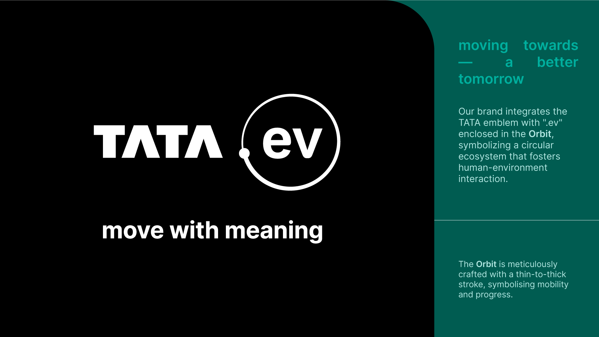
TATA.ev is the new identity that will be seen on the upcoming Tata Motors electric vehicles and will also be the face of a unique experience that the customers will get across various touchpoints from the brand, product and ownership cycle. The new identity will also represent Tata’s philosophy of 'Move with Meaning,' which brings sustainability, community and technology together.
Move with Meaning
The word 'move' depicts how the company is in the business of mobility but also acts as a platform for this new brand identity as a collective human movement towards EVs and a safer, smarter and greener future. The words 'with meaning' power up what TATA.ev stands for with a clear focus on responsibility, collective action, and future readiness.
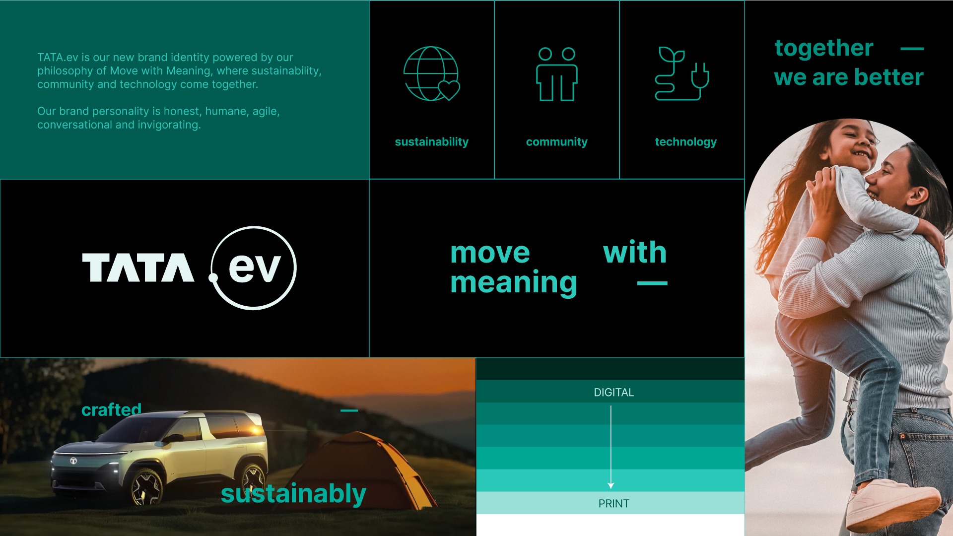
Vivek Srivatsa, head of marketing, sales and service strategy, Tata Passenger Electric Mobility said, “We are entering a new era with TATA.ev. Our new brand identity for electric vehicles underlines our commitment to accelerate the adoption of clean energy mobility solutions. We intend to drive positive change in the automotive industry with a focus on sustainability, community, and technology. Both the products and services are intended to create highly differentiated and meaningful consumer experiences. The brand personality is humane, honest, invigorating, and conversational – a rallying point for those curious about having a better impact on the world.”
Here are key points about the new logo:
The Orbit: The orbit showcases how TATA.ev represents a circular ecosystem of humans and the environment, moving towards creating a brighter future
The brand colour: The distinct Evo Teal colour is a fusion of technology and sustainability, which symbolizes innovation and tech-forward capability
Inter Typeface: The use of the existing font is due to the brand's sustainability-first approach
The character: The 'bridge' element adds character in communicating with a sense of motion and dynamism
In their commitment to sustainability, the TATA.ev design has used the following methods which make it environment friendly
All the print materials are designed on a white base in order to reduce the use of ink
All digital materials are made on a dark theme and are designed on a black base in order to conserve energy and reduce battery usage
The brand used Inter, an open-license font family, which gives wider reach, smaller file sizes, quick load times and optimised performance.
Now that we know what the new TATA.ev identity is all about how they are approaching sustainability and a greener future, we hope the upcoming EVs from their line-up are made with materials and processes that further cement their sustainability approach.
